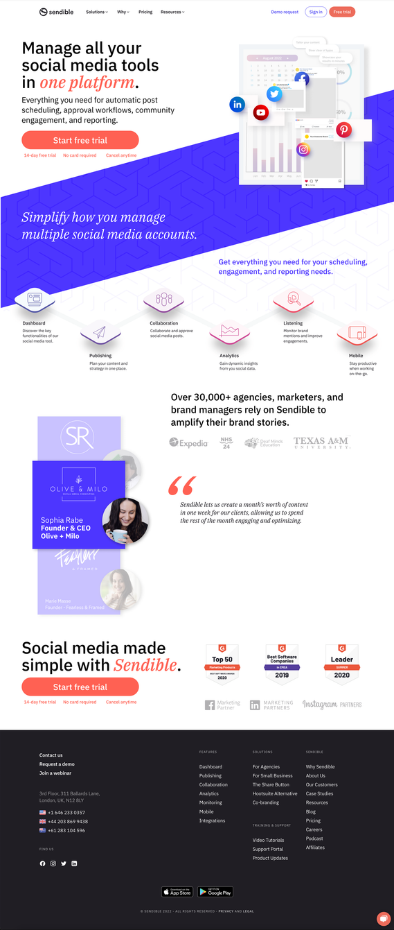
UI/UX — LANDING PAGE REDESIGN
From a UI/UX perspective, the objective of the Sendible landing page redesign was to enhance the conversion rate from visitor to trial user. Adhering to the company's existing design system and branding guidelines, I crafted a visually compelling page that proficiently conveys the advantages and functionalities of the social media management platform. The outcome is a unified and captivating landing page, strategically leading users to seamlessly explore and experience Sendible for themselves.
Research & Design Overview
I thoroughly researched the company's online presence and competitive landscape, utilizing the website, social media, and user testing with three participants. The user testing unveiled that the "free trial" call to action was overlooked by all participants, emphasizing the need for strategic design improvements.
The design process followed a progression from low-fidelity wireframes to medium-fidelity and high-fidelity mockups. This iterative approach allowed for continuous refinement.
In response to user feedback, I conducted additional user testing with three participants, observing their interaction with the current website without disclosing the company's purpose. This informed the creation of a visually appealing landing page with concise content, bold call-to-action buttons, and strategically placed graphics. The layout emphasizes key information, addressing the observed user behavior and ensuring a user-friendly experience. The design was executed using Figma and Adobe Illustrator.